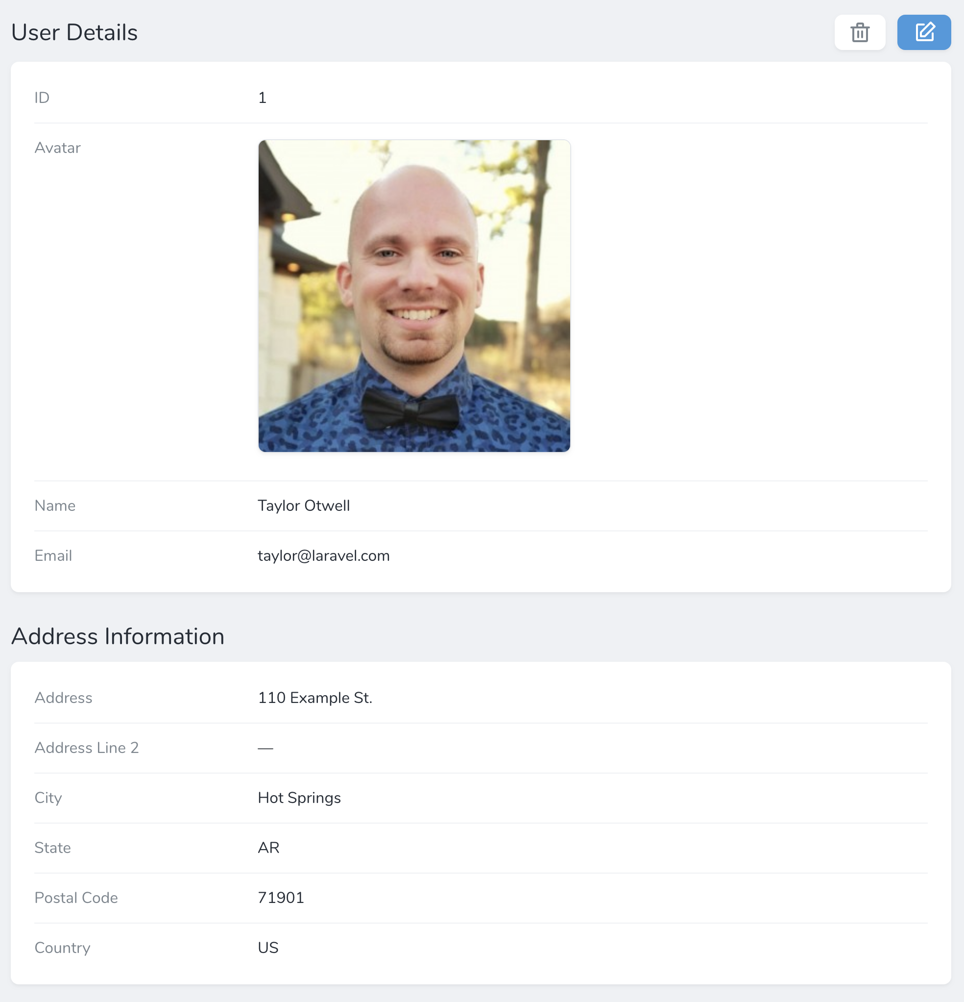
Panel instance within the fields method of a resource. Each panel requires a name and an array of fields that belong to that panel:
app/Nova/~Resource.php
Limiting Displayed Fields
You may limit the amount of fields shown in a panel by default using thelimit method:
Collapsible Panels
You may allow field panels to be collapsible by invoking thecollapsible method when defining the panel. This method utilizes JavaScript’s localStorage feature to remember the current state of the panel between requests:
collapsedByDefault method:
Tabs
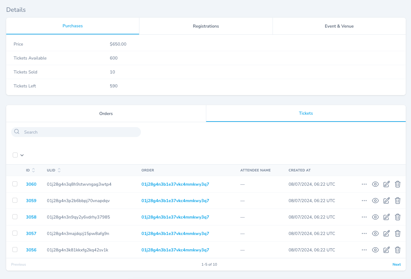
TheTab panel allows you to organize resource fields and relationships within tab panels:

Tab::group method. Each individual tab may be constructed using Tab::make and receives a tab title and array of fields:
app/Nova/Event.php
Omitting Tab Group Titles
Tab group titles may be omitted by simply providingfields to the Tab::group method: